About the Project:
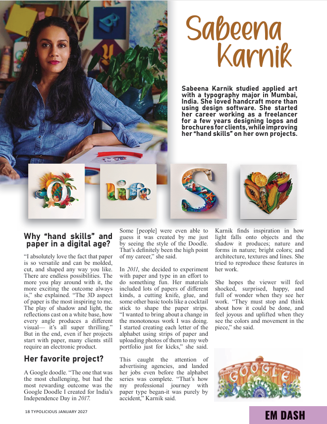
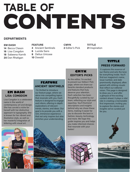
My magazine focuses on the exploration of typography, specifically focusing on various font families and typographers. I developed my own advertisements to promote fonts and their exploration. I learned about the process of laying out print media using InDesign. Grid systems, bleed lines, and text hierarchy were some of the tools I used to help create this appreciation of typography.
Accomplishments:
Visual Design: My design goals changed with the context of the pages. In the pages dedicated to font families I wanted the typography to come to life in stunning scenes while the typographer biographies were kept simple to help their work stand out even more. Bright colors and dynamic scenes grab the readers attention with every page turn.
Point of Pride: I fell in love with typography after these classes and this magazine. When I see fonts now, I see the complex choices the typographer made in choosing their mode of expression. I developed a deeper appreciation for the visual appeal words can bring to print.


